Mr.Tools Re-styling
Mr.Tools is the leading company in Spain for the sale of tools and machinery for jewelry manufacturing.
Client
Mr. Tools
Date
02-05/2025
Category
Branding, web design
Role
Designer
The re-styling of Mr.Tools aimed to modernize its identity without losing its essence, improving both visual perception and navigation experience.
🧠 Project Overview
Mr.Tools is a company specialized in selling tools and machinery for jewelry manufacturing, with national presence and strong growth within the sector. Its leadership in the Spanish market made it essential to update its image and digital experience, which no longer reflected the brand’s current strength, specialization, or commercial projection.
This visual and functional re-styling project aimed to create a more refined, complete, and coherent experience for the client—from first impression to navigation and interaction with the online catalog. Through this renewal, we sought to convey professionalism, structure, and modernity without losing authenticity.

👨💻 My Role
My work on Mr.Tools was comprehensive, covering both the strategic aspect of the redesign and the graphic implementation, as well as coordination with technical areas. My key responsibilities included:
Visual and UX audit of the previous site
Redesign of the logo, color palette, and visual system
Design of the new website interface with a focus on scalability
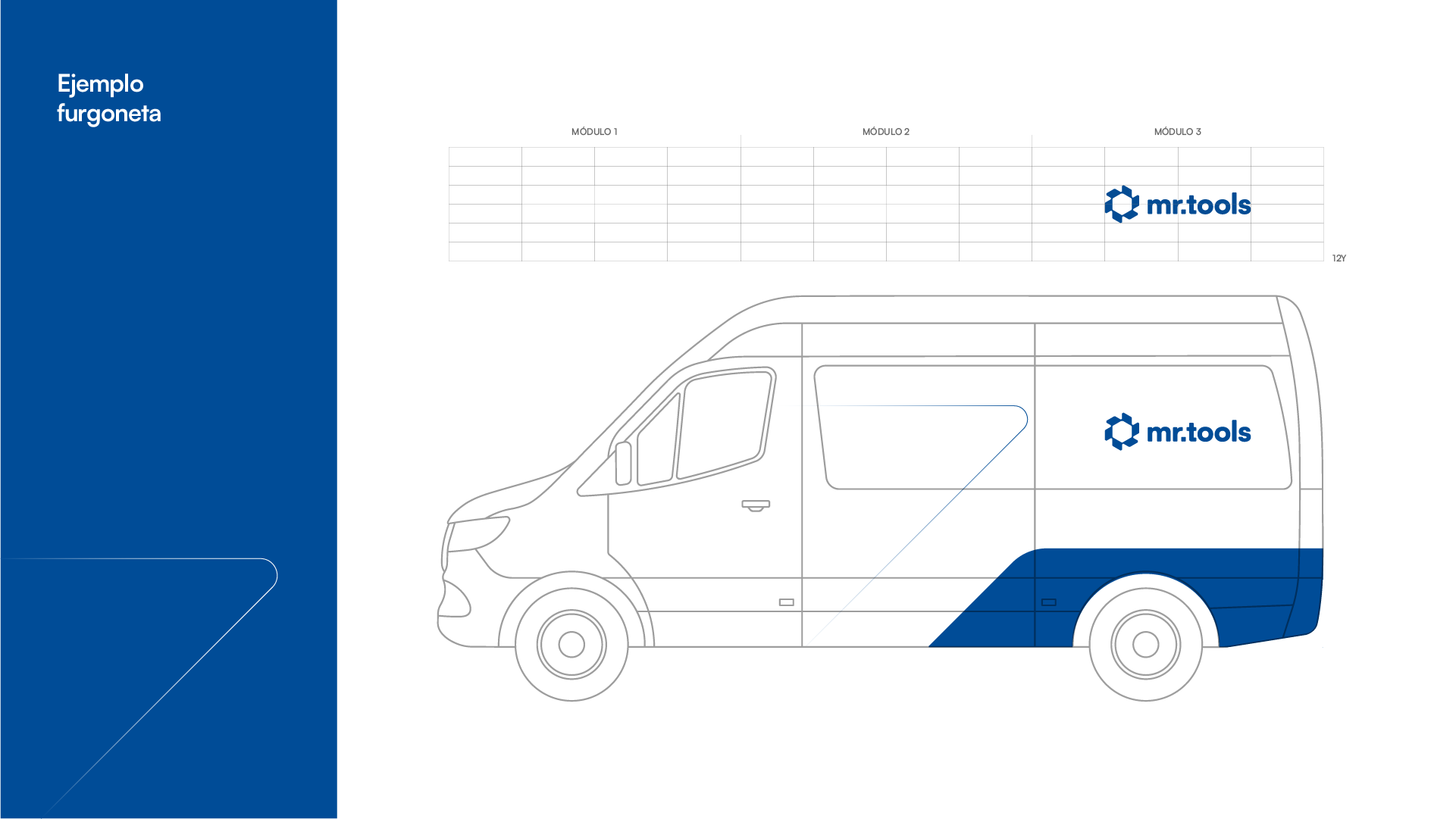
Adaptation of the identity to digital formats (website, banners, labels, visual communication)
🎨 Visual Identity Redesign
Mr.Tools’ previous image showed multiple inconsistencies: a generic aesthetic, limited harmony among visual elements, and a lack of alignment with the true quality of the company and its products. It was clear that the brand needed an evolution—not a rupture.
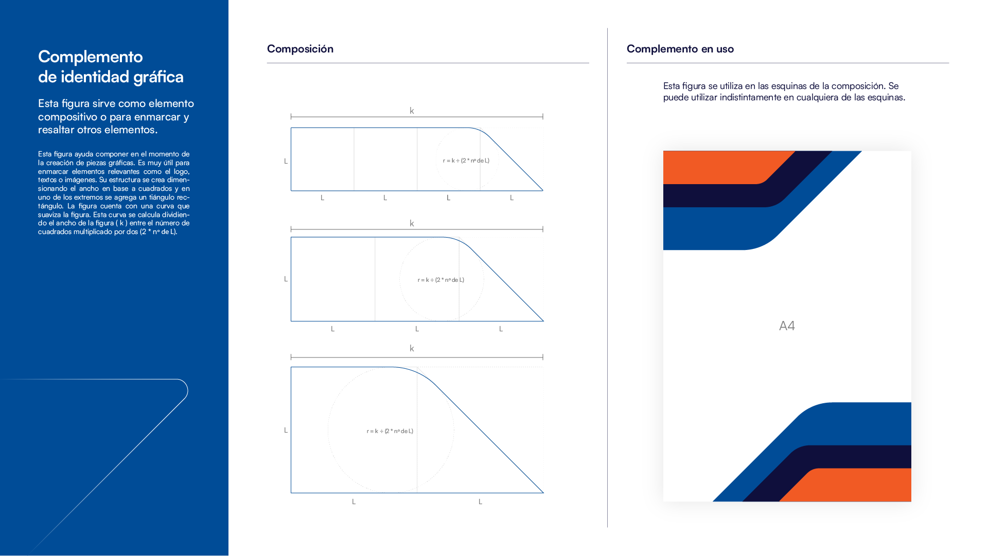
My proposal consisted of a sober and contemporary redesign that modernized the visual language without losing the company's DNA. The new logo was designed with clean lines and balanced proportions, achieving greater versatility and recognition across different digital environments.
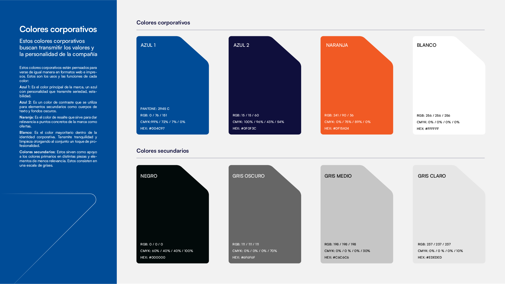
A high-contrast color palette was defined, using vibrant yet functional colors that highlight the product without overwhelming the interface. Dark and neutral tones balance the composition, providing a solid foundation on which to emphasize critical information.
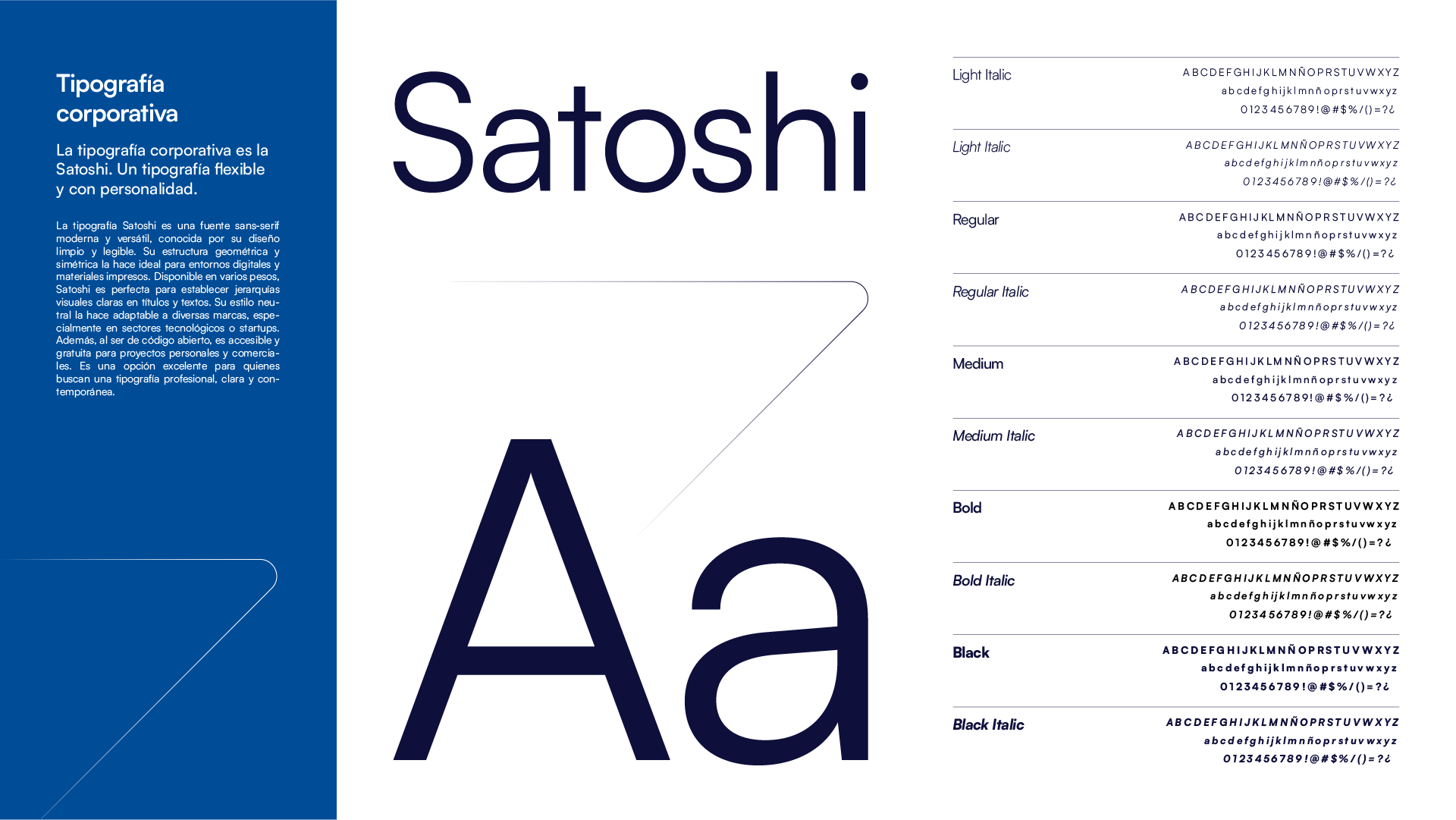
The new typography conveys a sense of technical professionalism and accessibility—key for a brand that operates between the industrial and the artisanal. A modular and scalable visual system was created, designed to support continuous growth of both the catalog and the brand.
👨🏻💻 Online Shop Redesign
The web redesign was one of the project’s greatest challenges, as the platform contained over 3,000 active product references and a complex database structure built in PHP. Although the ideal goal was to restructure the content and reorganize the catalog, the size and fragility of the existing system made deep intervention in the data architecture unfeasible.
Faced with this challenge, I chose to focus on designing a neutral, clear, and functional interface that did not add visual complexity but improved readability, navigation, and user perception. We worked with stable layouts, reusable components, and an optimized information hierarchy to ease the customer journey through the store.
Despite technical limitations, the new design allowed Mr.Tools to update its digital image and establish a much more coherent visual foundation aligned with its market leadership.
📚 Personal Reflection
This project was an excellent opportunity to apply a cross-functional and strategic design vision, integrating branding, interface design, and visual direction into a unified workflow. Having the opportunity to coordinate all dimensions of the project allowed me to ensure strong coherence between the brand message and its visual representation.
At the same time, I faced demanding technical challenges, especially related to data structure and legacy PHP systems, which limited the implementation of some restructuring ideas. This experience helped me develop pragmatic solutions adapted to a complex context and strengthened my ability to make visual decisions that bring value—even when it’s not possible to intervene in the entire system.